
A common message we get: “Our ads are working, people are coming to the store, but hardly anyone buys.” The instinct is to fix the ads, try a new audience, or push a discount. Most of the time that is the wrong place to start. If people are arriving and leaving, the store is the part that is not doing its job.
When we audit an underperforming Shopify store, we check the same five things first, in this order. They are the fixes that usually move revenue fastest, and none of them need a full redesign.
1. The first screen does not say what you sell, or why it is better
A visitor from an ad decides in a few seconds whether they are in the right place. If the first screen is a lifestyle photo with a vague line like “Elevate your mornings”, they have to scroll and work out what the product is. Many will not bother.
- Say what the product is in plain words, in the headline or right under it.
- Give one clear reason to choose it over the obvious alternative.
- Show the product itself, not just a mood image.
- Put one primary action above the fold (shop, or go to the product), not three competing ones.
2. The product page answers the wrong questions
Product pages are where buying decisions are made, yet they are often a photo carousel, a price and a paragraph of brand copy. Shoppers arrive with specific doubts: what is in it, how does it taste or fit, how is it different, what if I do not like it. If the page does not answer those, the doubt wins.
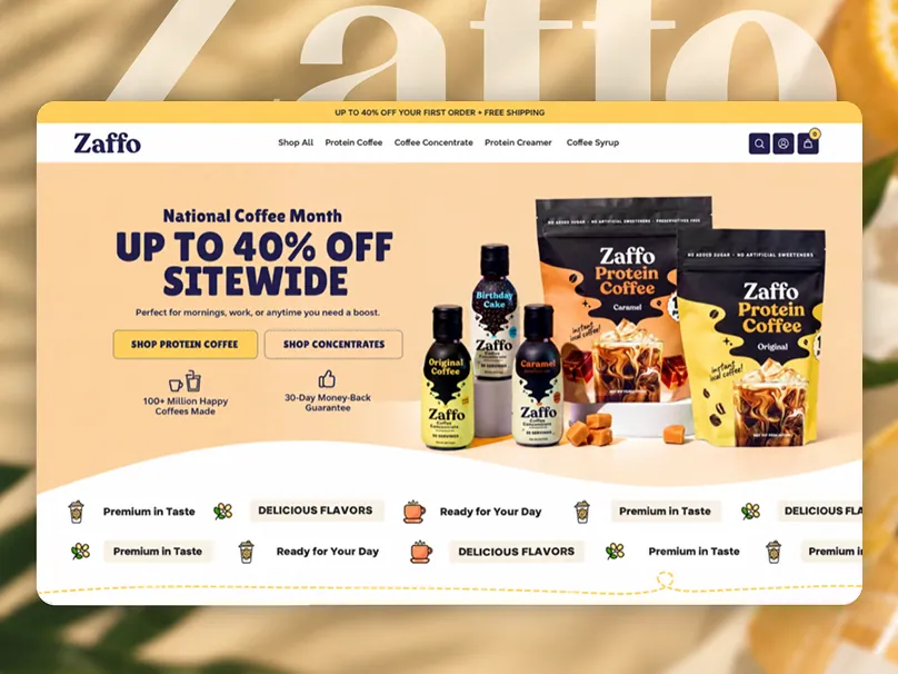
We rebuild the product page hierarchy around those questions: benefits first, then the details that remove risk (ingredients, sizing, shipping, returns), then proof. On Zaffo Coffee, a protein coffee brand whose ads were bringing in good traffic that was not converting, a big part of the work was simply making each product page clear about what the product is and who it is for.
3. There is nothing that makes a stranger trust you
Paid traffic is mostly people who have never heard of you. They need reasons to believe the store is real, the product is good and the order will arrive. Reviews buried in a tab, no guarantee and no visible shipping information all quietly cost sales.
- Place reviews and ratings near the price and the add-to-cart button, not only at the bottom.
- Make shipping times, costs and the returns policy visible before checkout.
- Use real photos and real customer content wherever you can.
- Keep the design consistent. A store that looks stitched together reads as risky.
4. The path to checkout has too much friction
Every extra step between “I want this” and “I paid” loses people: slow pages, pop-ups that interrupt the first visit, variant pickers that are hard to use on a phone, surprise costs at checkout. Most of this traffic is on mobile, so we walk the whole journey on a phone first.
Speed matters here too. Large uncompressed images and piles of apps are the usual culprits on Shopify. Removing what is not earning its place is often the quickest win of the whole project.
5. The ad and the landing page tell different stories
If the ad promises a specific product, offer or angle and the click lands on a generic homepage, the visitor has to start again. The closer the landing page matches the ad (same product, same message, same visual style), the more of that paid click turns into a sale. We go deeper on this in why paid traffic bounces.
What this looks like in practice
For Zaffo, we simplified the store, rewrote the homepage and product page hierarchy for clarity, improved speed and removed friction on the path to checkout. The redesign was done in Figma and built directly in Shopify, the platform the brand was already selling on.
The point was not a prettier store. It was to let more of the traffic they were already paying for move easily toward buying. That is the lens we use on every store: the pages your customers actually see, judged by whether they help someone buy.