
Visitors land on a SaaS page with a specific intent, usually from an ad, a search or a recommendation. Within seconds they need to understand what the product does, why it matters to them and how to start. If they cannot, they leave, and most of them do not come back.
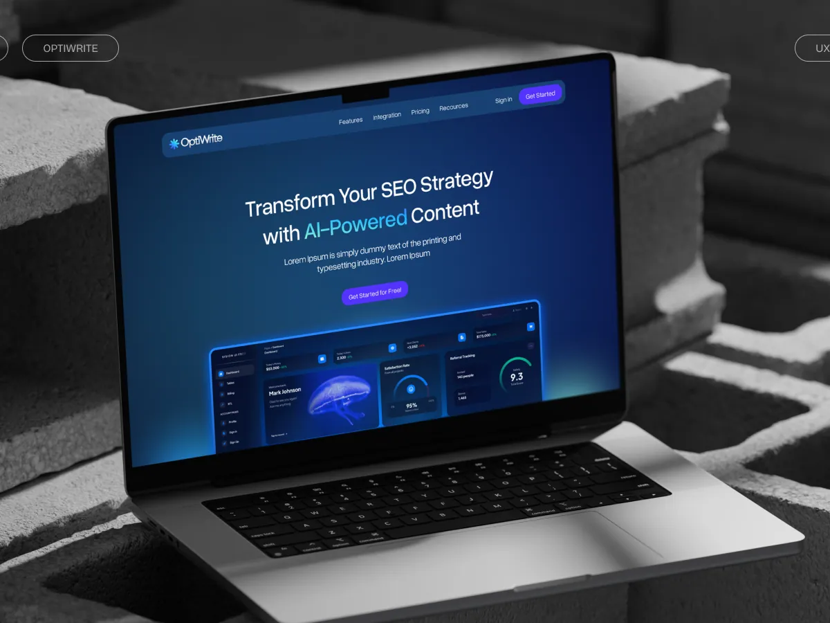
We design and build a lot of SaaS landing pages, for products like OptiWrite, an AI content tool, and a newly launched B2B SaaS product that had to speak to both business and consumer buyers. This is the checklist every page goes through before it ships.
Above the fold
- The headline says what the product does, in the customer’s words. Clever lines can come later.
- The subheading names who it is for and the result they get. “For marketing teams who need to publish more SEO content without hiring” beats a list of features.
- One primary call to action, worded as the next step (“Start free trial”, “Book a demo”), not “Submit” or “Learn more”.
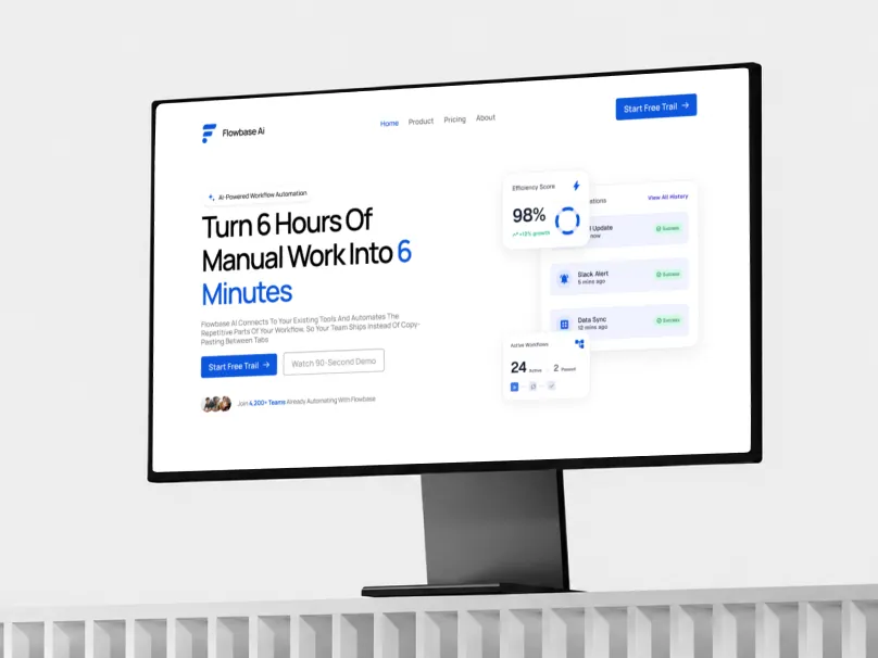
- A real product visual. Show the interface doing the job, not an abstract illustration.
- A trust signal near the CTA: customer logos, a rating, a short quote or a number that matters.
The body of the page
- Features are written around pain points. Each section starts with the problem it solves, then shows how.
- The page has one job. A landing page for a campaign should not also be the careers page, the blog and the docs. Remove links that lead away from the goal.
- Proof is spread through the page, not dumped at the bottom: a testimonial next to the feature it talks about, logos near the first CTA.
- Objections are answered before they are asked: pricing, setup time, integrations, data security, cancellation. A short FAQ does a lot of work here.
- The CTA repeats after each major section, so nobody has to scroll back to the top to act.
Signup and forms
- Ask only for what you need to start. Every extra field costs signups.
- Tell people what happens after they click: is it a trial, a demo call, a waitlist?
- Make error messages specific and friendly, and keep what they already typed.
- Test the full flow on a phone, including the confirmation email.
Speed, mobile and tracking
- The page loads fast on a mid-range phone on mobile data, not just on the office Wi-Fi.
- Every section is designed for mobile, not just shrunk: readable type, tappable buttons, no sideways scrolling.
- Analytics and conversion events are installed and tested before launch, so you can see what the page actually does.
- The page has a proper title, description and share image, so links look right in Slack, LinkedIn and search results.
Building it fast without cutting corners
We usually design in Figma and build in Framer or Webflow, which lets us ship quickly and hand the site over so your team can edit it without a developer. For the B2B SaaS project above, we designed the whole site, built it in Framer and handed the finished website to the owner.
Speed is only useful if the page is right, which is why this checklist exists. If you are about to launch or relaunch a SaaS page and want it reviewed against it, book a free strategy call or read more about our website development work.