
You can have a scroll-stopping ad, a strong offer and the right audience, and still watch most paid visitors leave within seconds. One of the most common reasons is simple: the page they land on does not feel like the ad they clicked.
The ad set up an expectation: a specific product, a promise, a look. If the landing page does not pick that thread up immediately, the visitor has to work out whether they are in the right place. Many decide they are not.
What “match” actually means
- Message match. The headline on the page echoes the promise in the ad, in similar words.
- Offer match. If the ad mentions a discount, bundle or free trial, the page shows it right away, not three clicks later.
- Product match. The ad shows a specific product, so the click goes to that product, not the homepage.
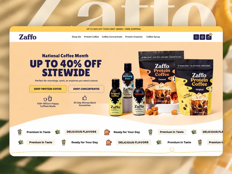
- Visual match. Same colors, same style of imagery, same product shots. The page should feel like the next frame of the ad.
- Audience match. An ad aimed at gym-goers and one aimed at busy parents should not land on the same generic page.
Common mismatches we see
- Every ad points to the homepage, whatever it promotes.
- The ad creative is premium and editorial, and the store looks like a default template.
- A seasonal offer in the ad is missing from the page, or has already expired there.
- The ad talks about one benefit and the page leads with a different one.
- The ad was made by one team and the page by another, with no shared brief.
How we line them up
Because we design both ad creative and landing pages, we plan them together. Each campaign angle gets a page, or at least a first screen, that continues the same story. The creative and the page share one brief: who it is for, the one thing we promise them, the proof, and the next step.
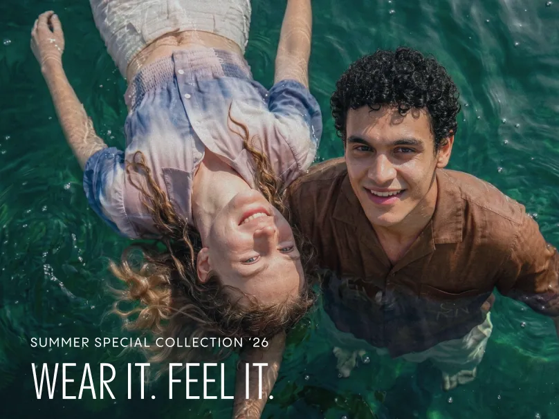
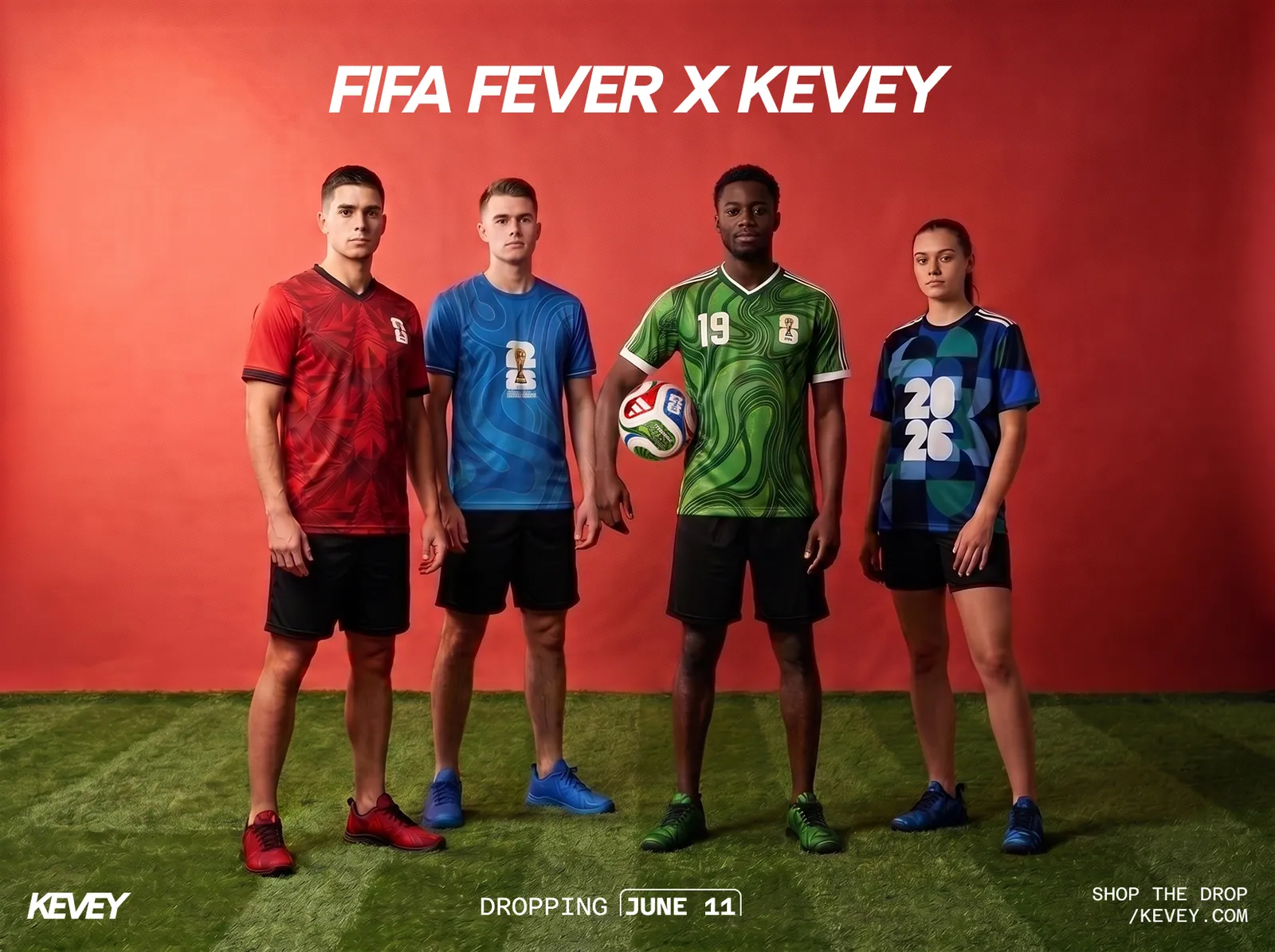
For sportswear brand KRYVE, we produced a collection of high-end, AI-generated sportswear visuals art-directed for social, ecommerce and paid ads, so the same look could run from the ad through to the product pages. For fashion brand SALTEN, we created campaign visuals around a single “Wear It. Feel It.” idea that could carry across every placement without a traditional shoot.
What to test first
- Send product ads to the product page, not the homepage.
- Rewrite the landing page headline to echo the ad’s promise.
- Bring the ad’s offer and hero visual into the first screen.
- Make one landing page per major audience or angle, even if only the first screen changes.
- Measure conversion per ad and page pair, not just click-through rate.
Better ads bring more clicks. Matching pages turn those clicks into customers. If you want both sides designed together, see our digital advertising and creative work or book a free strategy call.